
For the past few weeks I have been redesigning the Beardy Bee logo. It’s been more trying than anticipated but I think I’m finally there (for now)..

New Logo (2026)

Old Logo (2024)
The main goal of the redesign was to give the bee a bit more character / personality and a bit simpler overall.
The first step was to shrink the body and thicken the stripes (three instead of four), while keeping the features large and more prominent than the old version.
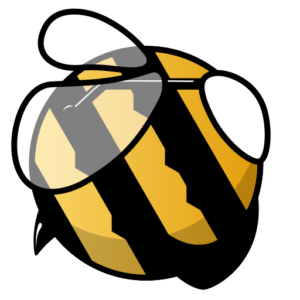
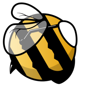
I had some suggestions to give the glasses a bit of tilt (which works really well) and possibly to add some veins into the wings, I was unsure about the veins as I didn’t think it worked with the overall aesthetic
I continued to try other ideas for the wings and landed on spirals, which I thought looked nice and fit the feel better. I added a subtle 3D effect to the body and some blue tint to the arm of the glasses following some additional feedback about this logo seeming a bit less colourful than the old one.

At this point i hit something of a wall, something about the eye of the bee wasn’t right, it lacked something, depth maybe?. After about 10 or so iterations, I landed on varying the width of the border around the eye, which gave it a bit more character and sense of depth, however now made the other fixed width borders seem very basic. What followed was several days of trying different version of eyes and borders before I decided to have a little break for a few days.
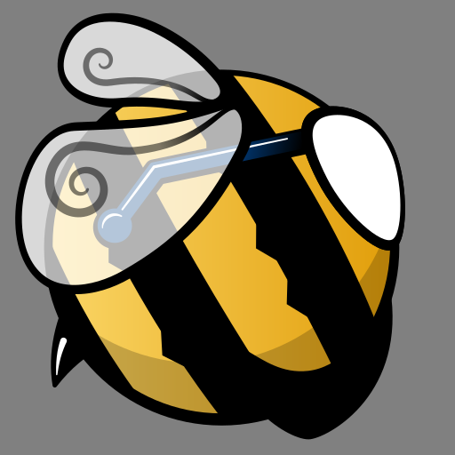
When coming back to this, I had a look at some photos of bees to see if I could figure out anything new for the wings or eyes. at this point it dawned on me that I have never given the bee any antennae! I wasn’t very keen on my first few attempts however.
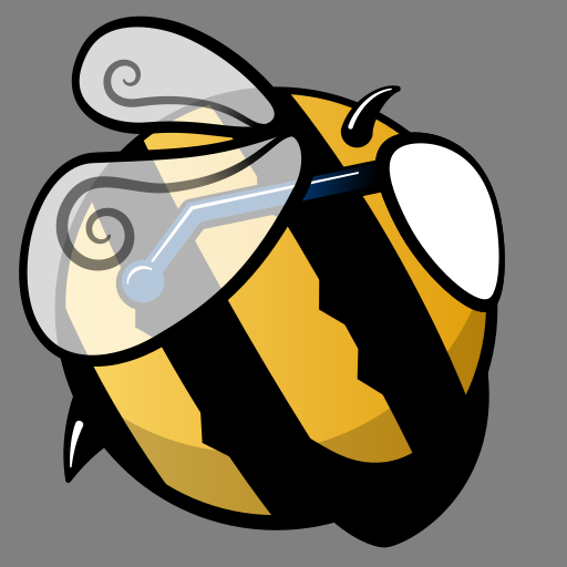
A little more tinkering with the wings’ spirals to fill more space, I also rotated and shifted the wings to keep the overall shape and round / compact as possible. Sticking with the spiral theme I quite liked the new antennae also.

As much as I was feeling relatively happy with the new border effects, everyone I asked (granted, it was a small sample size) preferred the previous mono width borders. Gemini (AI) suggested this could be due to the fixed borders being quicker to process therefore making the image feel easier to look it. I just really didn’t like something about the eye. I took another break for a day or so, before giving it another go. I tweak the shape of the eye and allowed the arm of the glasses to overlap the eye slightly, which stopped it looking quite as basic. a few other minor tweaks and I was feeling pretty happy with it for now. This will likely change, but for now I’m calling it a new version.
The logo is now live on the website and available on my spreadshop (https://brdb.myspreadshop.co.uk/)
